NYU Bus App
- Yifeng Pan
- Jun 10, 2024
- 7 min read
Updated: Jun 21, 2024


NYU BUS app was created to help NYU bus riders to reach their destinations promptly and effortlessly, without the need to navigate through multiple platforms and waste valuable time.
Problem Statement
NYU has seven bus routes running, each with its own schedule and bus stops. For NYU shuttle riders, catching the right bus at the right time without any hassle is a constant challenge. Every time they need to take NYU buses, these individuals need to navigate across multiple platforms such as Google Sheets, Google/Apple Calendars, Google Maps, and bus apps like Passio Go! to locate the buses and ensure timely arrival at their destinations. This challenge becomes even more pronounced for students who are unfamiliar with the NYU shuttle system.


User Research and Analysis
To gather insights from shuttle riders, I engaged with various students at different bus stops and times to understand their experiences with NYU bus services.
The interview questions explored topics such as:
What is your process for riding the NYU shuttle? Can you describe a recent experience catching a bus?
How often do you use the NYU Bus app or Passio Go!? Do you use Google Sheets to check the bus schedule?
What are your primary reasons for using the app?
What do you appreciate most about the app? What frustrates you?
What improvements would you like to see?
Based on the responses, I developed User Personas that reflect common characteristics, behaviors, goals, needs, and pain points observed during the interviews.

I created a User Journey Map to visualize the current experiences of shuttle riders, highlighting touchpoints, emotions, and pain points throughout their journey. This map helps identify key takeaways, actionable recommendations, and potential design opportunities aimed at improving the NYU bus app and enhancing overall user satisfaction.

Ideation
Based on the research, I decided to create a new NYU BUS app with the following functions:
Real-time bus locations and ETAs
Seamless navigation
Calendar sync
Plan itineraries in advance
Send timely reminders
To outline the ideal user experience that this app aims to deliver after implementing planned improvements and features, I created this Future State User Journey Map.

To better visualize how users will navigate through the application, I convert the Future State Journey Map into a User Flow Map. This process breaks down the journey into detailed steps and interactions, ensuring that the design effectively meets user needs.

Wireframes
At this stage, I sketched low-fidelity wireframes before moving on to high-fidelity prototypes.

Style Guide
Color
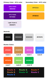
Considering that the NYU BUS app is exclusively designed for NYU students, I decided to adapt parts of the NYU color palette. I used NYU Violet, Ultra Violet, and Light Violet 2 as the primary colors. For secondary colors, I chose NYC taxi yellow because it is not only a classic NYC color but also a complementary color to purple.
For each route, I applied the set of colors used by the MTA to distinguish train lines. Since these colors might be used as text color against a dark background, I slightly increased their saturation and brightness. In 2024, I revisited this project and modified the color set to better align with the MTA color palette.


Icon
I designed the icon based on the appearance of NYU buses and the icons of Passio Go!, NYU bus, and the NYU app. The primary colors used in the icon are classic NYU Violet and white, ensuring a cohesive and recognizable look that aligns with NYU’s branding. The use of NYU Violet not only reinforces the university’s identity but also makes the icon easily identifiable among other apps.


Typefaces and Fonts
For years, NYU’s primary font was Gotham—a typeface built out of the fabric of New York City. However, when Gotham was acquired by a new type foundry and its price skyrocketed for all our digital properties, NYU replaced its primary typeface with NYU Perstare in February 2024.
The app was initially designed in 2023 using Gotham as the main font. Due to NYU's primary typeface change to NYU Perstare, I decided to recreate a version in May 2024 with some modifications based on the feedback I received.


Screenshots of the First Version Prototype (2023)
Log in + Access to Calendar
For first-time users, the onboarding process begins with logging in using their NYU NetID. After logging in, the app will request permission to access the users' calendars. This access is essential to keep track of classes and events, ensuring that the app can provide timely notifications and accurate scheduling information.

Schedule -> Add Event or Edit Event
Once users log in, they can access the Schedule tab, where their schedule is displayed with dates, timelines, events, and planned itineraries. My design prioritizes ease of reading and navigation, featuring clear labels and a visually appealing layout. Users can easily add events by clicking the Add button and edit specific events by selecting them. Any changes made to events will automatically update the planned itineraries, ensuring users have current travel plans at all times.

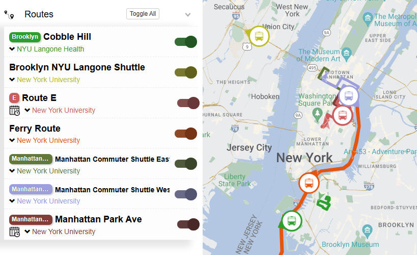
Notification + Get to Manhattan campus taking Route A
Once users have their schedules planned and updated in their synced calendars, they will receive timely notifications. By clicking on a notification, users will be directed to the navigation page. This page provides detailed information on how to get to the bus stop on time, including step-by-step walking directions. Additionally, it shows the real-time location of the bus, its estimated arrival time (ETA), and how long it will take to reach the destination. This seamless integration ensures that users have all the necessary information at their fingertips, reducing stress and making it easier to navigate the campus efficiently.


Bus -> Search for directions to a location (e.g. Empire State Building)
If users need to head to a location immediately and don't want to edit their schedule, they can go to the Bus tab and search for directions. After tapping the Search bar, they can input their destination or select one from their history. The default start point is their current location, with the start time set to now. Users can modify the start position and the departure or arrival time if needed. Based on this input, the app will provide recommended routes, ensuring users can quickly and efficiently find the best way to their destination.


Usability Testing (2023)
At this stage, I conducted a focus group to test the app's usability and understand users' needs. I gathered eight students who regularly ride shuttles and observed them using the app. Based on their feedback and my observations, I identified several possible improvements. These included:
Clarifying the time left between scheduled events.
Changing the color representing walking from orange to a neutral color, such as dark NYU purple or black, to avoid confusion with other routes.
Making the add button more prominent by adding shadow.
Clarifying time indicators for bus arrivals, as users found the format "(10)" or "(55)" confusing.
Adding emojis to notifications for clarity, such as 🚍 for bus notifications and❗for urgent alerts.
Including an indicator to show whether the user should be walking or riding the bus, potentially adding an icon on the side to show the current step.
Adding arrows between steps to indicate they are sequential.
Providing specific navigation details, such as "arrive at MetroTech at 12:30."
Reducing the size of events while making the recommended bus and walking sections larger for better visibility.
Displaying a banner or visual cue above the new recommended route to indicate that the user missed the original bus and the app is suggesting an alternative solution.
I tested the effectiveness of some changes with A/B tests, and then revised my design accordingly.

Screen Recording of the First Version Prototype (2023) - Revised
Design Iteration (2024)
In 2024, as NYU transitioned to its new primary typeface, I decided to revisit and refine this project. I conducted additional user testing sessions to uncover any previously undiscovered problems and areas for improvement. For this new version, I wanted to achieve a clean, modern look, so I made significant modifications to typography, color palette, and icon design.
I replaced all instances of the old typeface, Gotham, with NYU Perstare to ensure adherence to the university's updated branding guidelines. The transition to NYU Perstare not only aligned the app with the new visual identity but also contributed to a cleaner and more modern aesthetic.
I carefully adjusted font sizes and weights to enhance readability and create a clearer hierarchy. This typographic refinement ensured that users could easily navigate the app and quickly locate essential information.
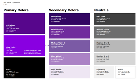
I updated the color palette to improve readability and better align with NYU’s visual style. By revisiting the MTA color set, I slightly increased the saturation and brightness of the colors for better visibility against dark backgrounds, while maintaining harmony with the NYU palette. This adjustment made the app more visually appealing and user-friendly.


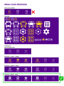
The menu icon redesign focused on matching NYU’s contemporary style, emphasizing simplicity and clarity. The new icons are more cohesive with the overall aesthetic and provide better visual cues for users. Unselected icons now have a lower weight and are in gray mode, while selected icons have a higher weight and bright color, making it easier for users to distinguish active tabs.


In addition, I removed drop shadow effects to streamline the design and achieve a flat, modern appearance. One of the major updates was to the calendar section, where I provided the month and year on top of the dates and changed the color palette from dark gray and orange to NYU Violet and white. This change enhanced the visual coherence and made the calendar more intuitive.

For coherence, I increased the corner radius of all buttons to make them round, contrasting with the shape of non-button components such as bus routes and events. This design choice added a subtle but effective visual distinction between interactive and non-interactive elements. After updating the colors of the calendar section, I changed the Add Event button to black and white. After removing yellow and black from the calendar section, this Add Event button, being the only component on the homepage with such a bold color, became the visual focus, making it easier for users to find and use.
To further enhance the user interface, I added a directional icon to the Start button, making it more prominent and intuitive. These changes collectively helped create a sleek and professional look with a cleaner visual hierarchy and aesthetics.


